Dashboards Profesionales y Buenas Practicas
Keywords
Summary
152 words
Critical Evaluation
Value of the Information & Strength of the Argument
The video offers practical value for users looking to enhance their dashboard design skills in Looker Studio. The instructor provides clear, step-by-step instructions with live demonstrations, making it easy to follow. The argumentation is based on practical experience and common best practices in data visualization, such as using dark backgrounds and cool colors to attract viewer attention. The instructor also highlights the importance of data type configuration and the use of interactive filters to make dashboards more dynamic. While the content is not backed by formal research, the advice is sound and aligns with general principles of effective data presentation. The tutorial’s strength lies in its hands-on approach and the sharing of practical tips that can be immediately applied.
Scientific Rigor, Source Quality, Title Accuracy
The video demonstrates a high level of rigor in its technical execution, with careful attention to data type settings and dashboard layout. The instructor uses a sample dataset and shows how to properly configure each field, which is a good practice for ensuring accurate visualizations. However, the video does not cite any external sources or references, which limits its scientific credibility. The title accurately reflects the content, as the video indeed focuses on professional dashboard creation and best practices. The instructor also mentions exploring external templates, but does not provide specific URLs or references. Overall, the video is well-structured and informative, but the lack of cited sources is a minor weakness.
245 words
Title / Content Match
The title accurately reflects the content, which focuses on professional dashboard creation and best practices in Looker Studio.
Quality & Reliability
7/10
The video provides a practical, step-by-step tutorial on creating professional dashboards in Looker Studio, with clear explanations and live demonstrations. The instructor demonstrates good practices in data type management, filtering, and chart selection. However, the video lacks formal citations and references to external sources, and the content is based on the instructor's experience rather than peer-reviewed research. The quality is high for a tutorial, but the scientific rigor is limited.
Key Moments
Markers derived by PSI from the transcript: the creator did not define chapters.
- Introduction and overview of the session's goals: creating professional dashboards in Looker Studio.
- Sharing the sample dataset and explaining its structure (products, categories, sources, etc.).
- Connecting Google Sheets as the data source and configuring data types (currency, percentage, date).
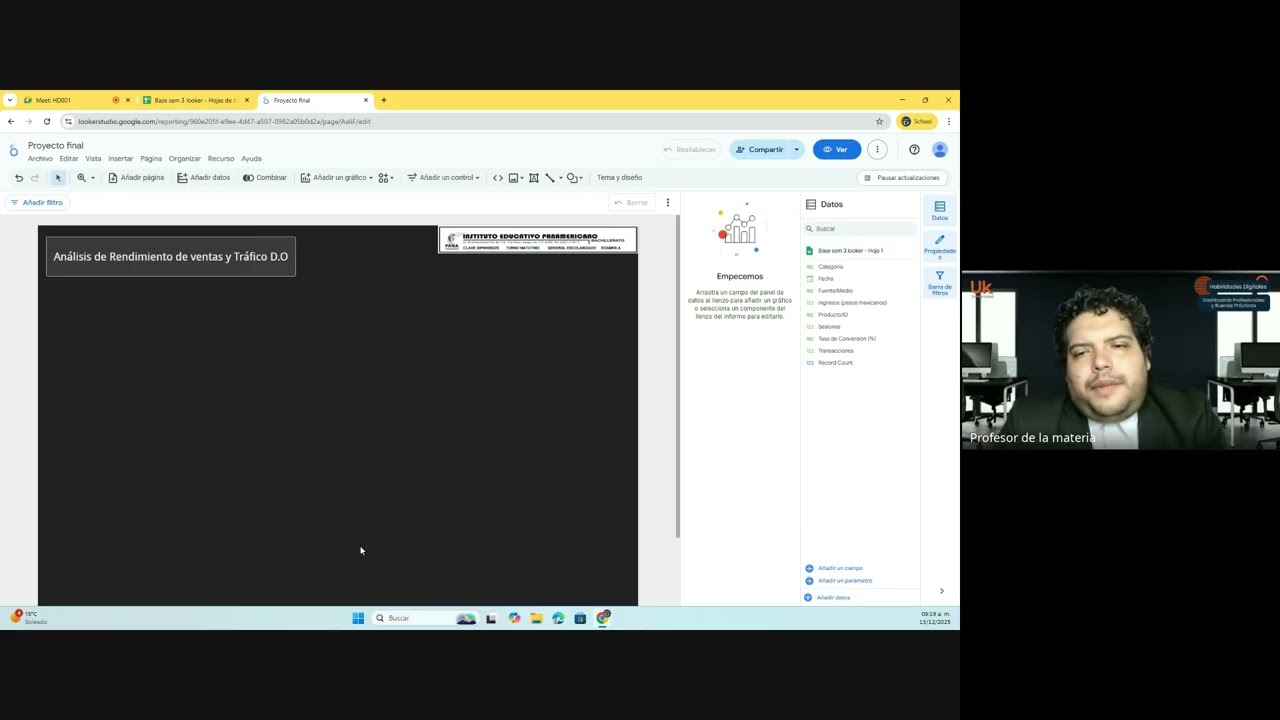
- Applying a dark theme with blue/purple colors and adding a title to the dashboard.
- Adding interactive controls: advanced filter for product and period filter for date range.
- Creating scorecards for key metrics like revenue and transactions, and adjusting dimensions and metrics.
- Adding bar charts and time series to visualize trends over time.
- Using pivot tables to analyze data by source and medium, with multiple metrics.
- Adjusting canvas size for different presentation formats (e.g., 16:9) and discussing layout.
- Exploring external templates for inspiration and discussing how to use them in Looker Studio.
Contribution & Novelties
The video provides a practical, hands-on guide to creating professional dashboards in Looker Studio, with a focus on best practices such as proper data type configuration, interactive filters, and effective visual design. It offers a step-by-step approach that is accessible to beginners while also providing tips for more advanced users. The instructor’s emphasis on using dark themes and cool colors is based on recent trends in data visualization, which adds a contemporary touch. The video also encourages exploring external templates, which can save time and provide inspiration.
Pour aller plus loin :
- Looker Studio Help Center — Official documentation for Looker Studio, including guides on data sources, charts, and controls.
- Data Visualization Best Practices — Tableau’s article on effective data visualization techniques, relevant to dashboard design.
- Color Theory for Data Visualization — An article discussing color choices in data visualization, supporting the instructor’s advice on using cool colors.
148 words
Radar Profile
The radar profile shows balanced scores across all dimensions, with slightly higher scores in information quantity and quality, reflecting the tutorial's comprehensive coverage and practical value. The technical level is moderate, suitable for beginners, and the overall reliability is good, though limited by the lack of cited sources.