Graphiques de présentation de données en épidémiologie
Keywords
Summary
154 words
Critical Evaluation
Value of the Information & Strength of the Argument
The video provides valuable, practical guidance on data visualization in epidemiology, grounded in standard statistical principles. The author’s arguments are clear and well-structured, with each chart type explained in terms of its purpose, construction, and limitations. He uses concrete examples, such as hospital stays and student satisfaction scores, to illustrate the concepts. The advice to avoid 3D charts and excessive decoration is supported by reasoning about readability and accuracy. The emphasis on simplicity and honesty in presentation is a strong point, as it aligns with best practices in scientific communication. The tutorial is particularly useful for students and professionals in epidemiology and public health who need to present data effectively.
Scientific Rigor, Source Quality, Title Accuracy
The scientific rigor is high, as the content is based on established statistical conventions and the author’s expertise. However, the video does not cite specific scientific sources or references, relying instead on the author’s knowledge. The title accurately reflects the content, which is focused on graphical presentation methods. The description provides links to additional resources, including a course website and quiz platform, which are useful for further learning. The video is well-structured with clear chapter markers, aiding navigation. Overall, the tutorial is reliable and trustworthy for educational purposes.
213 words
Title / Content Match
The title accurately reflects the content, which focuses on graphical presentation of data in epidemiology.
Quality & Reliability
8/10
The video is a well-structured tutorial by an expert in epidemiology and statistics, covering standard graphical methods with clear explanations and practical advice. The content aligns with established statistical practices, and the author provides additional resources for further study. However, no specific scientific sources are cited within the video, and the presentation is based on the author's expertise.
Key Moments
Markers derived by PSI from the transcript: the creator did not define chapters.
- Introduction to pie charts for nominal categorical variables.
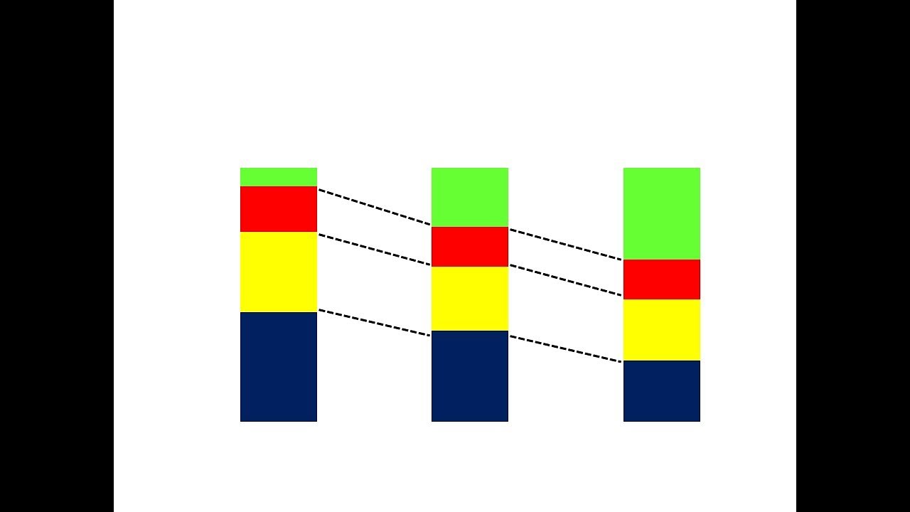
- Explanation of 100% stacked bar charts for comparing distributions.
- Use of horizontal bar charts for variables with many categories.
- Vertical bar charts for ordinal categorical variables.
- Histograms for quantitative variables, discrete and continuous.
- Frequency polygons for continuous quantitative variables.
- Cumulative frequency graphs.
- Multiple bar charts for two variables.
- Population pyramids for age-sex distributions.
- Scatter plots for exploring relationships between two quantitative variables.
- Discouraged practices: 3D charts, excessive colors, and complex multi-series graphs.
Cited Sources
- Formation Epiter - Statistics and Epidemiology Courses — List of complete courses in statistics and epidemiology.
- QCM Quizz - Exercises and Quizzes — Exercises, QCMs, and quizzes for practice.
- Related video on tables — First part of the course on data presentation in tables.
Concurring Sources
- Formation Epiter - Statistics and Epidemiology Courses — The author's own course materials align with the content presented.
- QCM Quizz - Exercises and Quizzes — Practice exercises complement the tutorial.
Contribution & Novelties
The video offers a clear, systematic overview of graphical methods for epidemiological data, with practical advice on when and how to use each type. It emphasizes simplicity and honesty in data presentation, which is often overlooked in favor of flashy graphics. The tutorial is particularly valuable for students and professionals who need to present data effectively in conferences or publications.
Pour aller plus loin :
- Data visualization guidelines — A comprehensive guide to choosing the right chart type.
- Color blindness awareness — Information on color vision deficiency and design considerations.
- Edward Tufte’s principles of data visualization — Classic works on graphical excellence and integrity.
104 words
Radar Profile
The radar profile shows high scores in information quantity, quality, and reliability, with a slightly lower technical level, indicating a well-balanced educational resource that is both informative and trustworthy.